
It might help to remember that Insulin Therapy AnalysisTM is endorsed and used by a current member of the Board of Directors of the AADE, Dr. Richard Guthrie, MD, CDE. Dr. Guthrie is one of the principal authors of the AADE's "bible" on Diabetes Education: A Core Curriculum for Diabetes Educators. Diabetes Online is extremely proud of such this powerful endorsement.
| If graphs and plots are intimidating for you, remember: | |
| You can easily drive your car without knowing details about how its engine works. | |
| You can easily drive ITA without knowing details abouthow its "engine" works. | |
| But many people will want to see this! | |
| So here we go... |
First, a few warnings:
Do not mistake these results for your regime!
Remember, you are looking "under the hood" to see how ITA handles BarbS' personal regime.
If you see things that you think might apply to you, GO SEE YOUR DOCTOR!
Also, if you are unfamiliar with the use of industry standard insulin curves, please visit Eli Lilly's excellent web site! A direct link to the Lilly curves has been provided near the end of this Tour.
Eli Lilly's insulin curves were used during the construction of this ITA medical simulation. |
For your convenience, here is BarbS' real life regime as she submitted it.
| Regime | Client's own description |
|---|---|
|
|
| Now here is MORE of the ITA picture.... |
Below is the ITA computer screen of BarbS' regime. (This is exactly what you would see on your own computer when you click on ITA's Graphs button, annotated for this presentation).
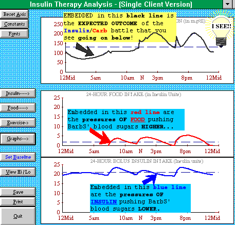 |
This top plot shows simulated blood glucose levels (figure 1a)
This middle plot shows: Carb Loading
(figure 2a) This bottom graph shows: Available Insulin (bolus) (figure 3a) |
Now, lets look at each of the three different plots above:
The top plot (figure 1a) is often the most important graphic: It's where you would see your expected blood sugar levels IF you had typed in YOUR usual food and insulin regime.
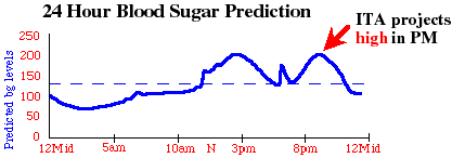
Below is the top plot again; this time I prettied it up so I could highlight some of the important things that ITA is communicating. Please, compare FIGURE 1A (below) with figure 1a (above) with , you'll see they are exactly the same.
| This is what medical science expects should happen, based on BarbS' real life food/insulin regime. | |
 |
|
| FIGURE 1A (the top plot above): This is BarbS' predicted blood sugars (annotated). | |
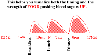
Then, to show how the expected bg levels in fig 1a are derived, I took the middle plot (figure 2a) and prettied it up, and the bottom plot (figure 3a) and prettied it up also.
The top one (fig 2A below) shows CARB LOADING: the carb loading rates, timings, etc., come from clinical trials and hospital studies.
The bottom one (fig 3A below) shows AVAILABLE INSULIN. The absorption rates, timings, etc., came from Eli Lilly insulin curves as well as other industry standard published information!
 |
||
| FIGURE 2A (above), annotated for emphasis and clarity, shows carb loading. | ||
| And FIGURE 3A (below) shows available (bolus) insulin. | ||
 |
||
| ITA compares the above (blue) Available Insulin (fig 3A); to the above (red) Carb Loading (fig 2A). Think of it as a "Battle of the Bulges"; that insulin is battling carbs. In this case, the Humalog bulges might be too *quick* and *pointy* when compared to Food bulges. | ||
Now, I'll use ITA to try to IMPROVE BarbS' regime .. ITA is Computer Aided Design for Diabetes!
Investigate reducing size of BarbS' dinner? |
|
Investigate reducing BarbS' NPH? |
|
Investigate shifting BarbS' NPH? |
|
What if I want to see how Humalog Works? |
|
See if Ultralente might help? |
|
How about Lente, Semilente, Regular ... |
|
Investigate shifting the timing of a meal? |
Yes, with ITA, you can do a "what if" analysis on your computer. But before we go on, please read the following warnings carefully:
Do not mistake these results for your regime!
Remember, you are looking "under the hood" to see how ITA handles BarbS' personal regime.
Also, changing any diabetic health care plan can be dangerous. Make no changes to any therapy regime without approval of your physician/health care team. This analysis is not a substitute for the sound medical advice of your personal physician or health care team. Use of ITA software or these results constitutes agreement by user that user assumes all responsibility for use or misuse of these results. Consult your Doctor.
| So here we go... |
Now, ... here is the NEW insulin picture (figure 3B below) compared with the food picture (figure 3A below) ....
|
||
| FIGURE 2A (above), annotated for emphasis and clarity, shows carb loading. (This graphic remains unchanged because we didn't shift or change any meals.) | ||
| Now, ... figure 3B shows the new insulin schedule adjustments. | ||
 |
Available Insulin (bolus) pushing bG levels DOWN. | |
| ITA compares the NEW (above, blue) Available Insulin (fig 3a); to the (red) Carb Loading (fig 2a). Think of it as a "Battle of the Bulges"; that the bottom graph shows insulin bulges which are battling the carb bulges of the graph right above it. | ||
And the new outcome of the *Battle of the Insulin/Food Bulges* is shown below exactly as the patient would see it on their own PC monitor:
 |
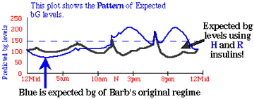
.... and this next ITA graphic just compares the OLD (light blue) with the NEW (black line) predicted insulin coverages. The black line shows that, in BarbS' case, R insulin added to her H insulin should s*t*r*e*t*c*h out the duration of the available (bolus) insulin. The ITA graphs suggest an improvement in her BG levels is possible, and she will want to show this ITA analysis to her doctor!
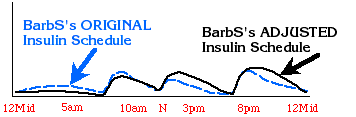 |
Insulin timing and amounts are better here! |
And here is an (annotated) graphic showing the possible improvement. ITA can present credible, credentialed evidence to your doctor for improving an IDDM's insulin/food regime!
 |
Conclusion:
To design an improved regime, try to better match what your FOOD is doing (driving bG levels UP) with INSULIN (driving bG levels DOWN). In Barb Schiller's case, that might mean taking some R with her H insulin.
And this is the end of this DiabetesOnline tour of BarbS' regime. I hope you can see that ITA is important medical software!
Warning: I am NOT a physician. Changing any diabetic health care plan can be dangerous. Make no changes to any therapy regime without approval of your physician/health care team. This analysis is not a substitute for the sound medical advice of your personal physician or health care team. Use of ITA software or these results constitutes agreement by user that user assumes all responsibility for use or misuse of these results. Consult your Doctor.
Part 2 was meant to be a technical discussion touching on some of the medical algorithms and concepts that ITA uses. Please don't be intimidated by 'LOOKING UNDER THE HOOD!" Part 1 shows how easy ITA is to use!
Oh, I promised you at look at Eli Lilly's industry standard insulin curves! (Please come back! and tell me what you think. Only YOU can help me improve the educational value of these important presentations.)
Barb Schiller describes her quest for good control in her posts to the internet diabetes support group Diabetic@Lehigh.edu.